January 14, 2015
Custom Code Used For This Design
Occasionally we need to use custom html to obtain the layouts shown on our demos in specific modules. The code below is what was used on this template. It is best to enter this code directly into the HTML editor function of your editor.

Code used for title area:


The below code is what is placed in each "button text" area for the Tab Show:


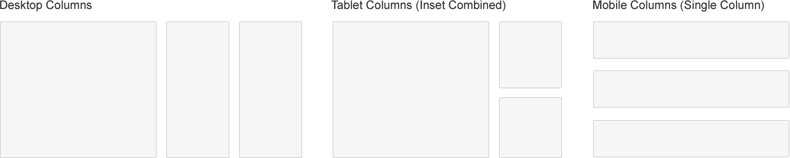
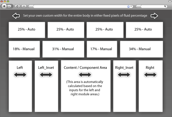
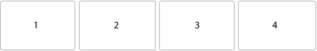
Example shown with full width items:


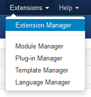
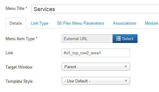
1. The first step to create the centered logo is to create an external link menu item and publish it between all your other menu items. To get it centered at a good spot you may have to reword or add/remove a menu item since the logo is just another menu item itself. It works best when you have an even amount of menu items so that you can just stick the logo right in the middle of them. Below is a screenshot of this first step under the Joomla menu manager area.

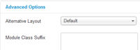
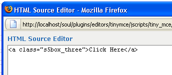
2. The next step is to click the tab "link type" and enter in the CSS class for the logo so the design knows where to position your logo. So enter in the class "s5_logo_spacer" as shown below:

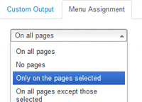
3. Next you may need to edit the vertical position of your logo here:
Image and Content Fader Code:
Simply enter the images and into the default fields in the backend of the module. This demo uses 2000x1030 images, but you can use any image size; just make sure they are all the same size. Features like size, zoom, slide effects, and others are controlled in the module's backend. The module is published to the "custom_3" module position
Code used for title area:
<span class="s5_boldfont">Welcome</span> to Charlestown!
Code used for description area:
<span class="center">
A diverse community of nearly 60,000, located approximately . Etiam mi magna, laoreet eu interdum sit amet, convallis semper velit. Donec facilisis
<br>
<a href="#s5_bottom_row1_area1" class="readon">Read more</a>
</span>
A diverse community of nearly 60,000, located approximately . Etiam mi magna, laoreet eu interdum sit amet, convallis semper velit. Donec facilisis
<br>
<a href="#s5_bottom_row1_area1" class="readon">Read more</a>
</span>
Menu Overlay:
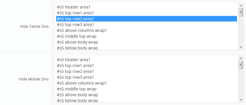
The custom_4 is a position that will show on top of the custom_3 module position. It will only show when there is a custom_3 module published. For the demo we published our Image and Content Fader to the custom_3 position. The custom_4 position is designed to show a menu as we have demo'd and the scroll bar will only show if the content extends past the vertical height of the position. Just simply publish a standard Joomla menu to the custom_4 module position:
Tab Show Icon Mode:
The Tab Show is published to the "below_columns_1" module position and has a custom class of "-icons" and a module suffix of "-default"
The below code is what is placed in each "button text" area for the Tab Show:
<span class="ion-android-bus tabshowicons"></span>Transportation
Social Icons:
This is one custom HTML module that is published to the custom_1 position. Ion Icons must be enabled in the template configuration for these to show.
<a class="social_icon ion-social-facebook"></a>
<a class="social_icon ion-social-twitter"></a>
<a class="social_icon ion-social-googleplus"></a>
<a class="social_icon ion-social-rss"></a>
<a class="social_icon ion-social-twitter"></a>
<a class="social_icon ion-social-googleplus"></a>
<a class="social_icon ion-social-rss"></a>
Upcoming Events Dates:
This is a custom HTML module published to the "s5_tab1" module position.
<div class="date_outer_wrap">
<div class="date_text_wrap">
<div class="date_wrapper">
<div class="date_top">DEC</div>
<div class="date_bottom">15</div>
</div>
New Park Celebration Etiam mi magna, laoreet eu interdum sit amer</div>
<div style="clear: both;"></div>
</div>
<br />
<div class="date_outer_wrap">
<div class="date_text_wrap">
<div class="date_wrapper">
<div class="date_top">NOV</div>
<div class="date_bottom">09</div>
</div>
New Park Celebration Etiam mi magna, laoreet eu interdum sit amet</div>
<div style="clear: both;"></div>
</div>
<br />
<div class="date_outer_wrap">
<div class="date_text_wrap">
<div class="date_wrapper">
<div class="date_top">OCT</div>
<div class="date_bottom">23</div>
</div>
New Park Celebration Etiam mi magna, laoreet eu interdum sit amet</div>
<div style="clear: both;"></div>
</div>
<br />
<div class="date_outer_wrap">
<div class="date_text_wrap">
<div class="date_wrapper">
<div class="date_top">OCT</div>
<div class="date_bottom">12</div>
</div>
New Park Celebration Etiam mi magna, laoreet eu interdum sit amet</div>
<div style="clear: both;"></div>
</div>
<div class="date_text_wrap">
<div class="date_wrapper">
<div class="date_top">DEC</div>
<div class="date_bottom">15</div>
</div>
New Park Celebration Etiam mi magna, laoreet eu interdum sit amer</div>
<div style="clear: both;"></div>
</div>
<br />
<div class="date_outer_wrap">
<div class="date_text_wrap">
<div class="date_wrapper">
<div class="date_top">NOV</div>
<div class="date_bottom">09</div>
</div>
New Park Celebration Etiam mi magna, laoreet eu interdum sit amet</div>
<div style="clear: both;"></div>
</div>
<br />
<div class="date_outer_wrap">
<div class="date_text_wrap">
<div class="date_wrapper">
<div class="date_top">OCT</div>
<div class="date_bottom">23</div>
</div>
New Park Celebration Etiam mi magna, laoreet eu interdum sit amet</div>
<div style="clear: both;"></div>
</div>
<br />
<div class="date_outer_wrap">
<div class="date_text_wrap">
<div class="date_wrapper">
<div class="date_top">OCT</div>
<div class="date_bottom">12</div>
</div>
New Park Celebration Etiam mi magna, laoreet eu interdum sit amet</div>
<div style="clear: both;"></div>
</div>
Quick Link Boxes:
This code is published to a custom HTML module published to the bottom_row1_1 position.
<br /><br /><br /><br />
<a href="#" class="s5_iconwrapper"><span class="s5_iconlinks ion-ios-box-outline"></span> Forms</a>
<a href="#" class="s5_iconwrapper"> <span class="s5_iconlinks ion-ios-information"></span> Emergency</a>
<a href="#" class="s5_iconwrapper"> <span class="s5_iconlinks ion-ios-locked-outline"></span> Police</a>
<a href="#" class="s5_iconwrapper"> <span class="s5_iconlinks ion-ios-checkmark"></span> Payments</a>
<a href="#" class="s5_iconwrapper"> <span class="s5_iconlinks ion-ios-copy-outline"></span> Permits</a>
<a href="#" class="s5_iconwrapper"> <span class="s5_iconlinks ion-ios-compose-outline"></span> Contact Us</a>
Quick link box text:
This code is published to a custom HTML module published to the bottom_row1_2 position.
<br /><br /><br /><br />
<h3 class="h3largetitle highlightfont">Quick links for your convenience</h3>
Need to pay a sewer bill, contact the police, read up on regulations? these and more can be found here.<br /><br />If you canâ??t find what you are looking for always feel free to contact us and drop us quick message.<br /><br /> <a class="readon" href="#">More information</a> <br /><br /><br /><br /><br /><br />
Latest News Text:
This code is published to a custom HTML module published to the bottom_row2_1 position.
<span class="newsletter_text">Stay <strong>up to</strong> date<br>with the <strong>latest</strong> news in town</span>
Upcoming Meetings and Alerts:
This is the Joomla "Article - Categories" module published to the left position. We used the module style "-highlight2line" and "-highlight1line":
S5 Masonry:
This module is published to above_body_1 and does not use any custom HTML. The images and defined as the article's intro image in the settings of the article. We have set the display type to "overlay" and selected the item width to "first item only":
Example shown with full width items:
Township Office:
This is a custom HTML module publishd to the custom_6 position.
<span class="addressicon ion-android-home"></span> <span class="address_wrap"> Charlestown Township<br /> 1000 Ross Municipal Drive<br
/> Bigtownville, CO 15237 <br /><br /> </span>
<div style="clear: both;"></div>
<span class="addressicon ion-ios-telephone"></span>123-123-1234
/> Bigtownville, CO 15237 <br /><br /> </span>
<div style="clear: both;"></div>
<span class="addressicon ion-ios-telephone"></span>123-123-1234
Centered Logo
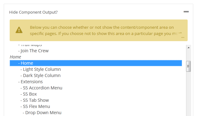
In this design we have for the first time included a centered logo within the main menu. To do so we had to add some JavaScript and custom CSS. Below is a screenshot of the logo as seen on the site and following it is a small tutorial to guide you on how to set this up.
1. The first step to create the centered logo is to create an external link menu item and publish it between all your other menu items. To get it centered at a good spot you may have to reword or add/remove a menu item since the logo is just another menu item itself. It works best when you have an even amount of menu items so that you can just stick the logo right in the middle of them. Below is a screenshot of this first step under the Joomla menu manager area.
2. The next step is to click the tab "link type" and enter in the CSS class for the logo so the design knows where to position your logo. So enter in the class "s5_logo_spacer" as shown below:
3. Next you may need to edit the vertical position of your logo here:
#s5_header_area_inner .s5_logo_spacer .s5_logo_css {
margin-top: -20px;
}
template.css (line 575)
margin-top: -20px;
}
template.css (line 575)
Hits: 5044